A landing page is a page on your website that allows you to offer something of value in exchange for the visitor’s information through a form. It is designed for the sole purpose of conversion (e.g. visitor to lead). It is the page that “gates” the marketing offer. What that means is the person needs to fill-up the form in order to access the offer.
Generally, a landing page can refer to any page on your website that a person “lands on,” but when it comes to effective digital marketing, we will refer to a landing page as a page designed solely for the purpose of conversion.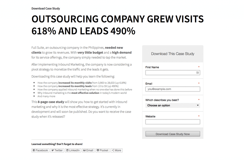
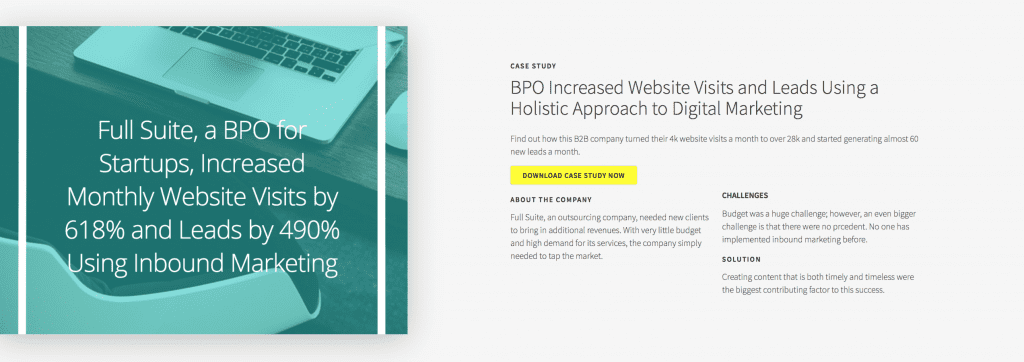
The image above is an example of a landing page here on my site. It’s a case study about an outsourcing company and how I helped them grew their visits and leads.
Before any person can download the landing page, they have to fill-up the form first. Then, they get redirected to a thank you page where they can download the case study.
9 Key Elements of a Landing Page
1) No Navigations
If you look at the image, you would notice that there are no navigation links in the header and footer. The primary reason for this design is that it supports the primary purpose of the landing page — to convert.
Navigation menus are distractions. People can navigate away from your landing page (thus, not helping you convert them) or visually distract them from the main message of your offer.
So, with no clear benefit and lots of risks, it’s better to remove them altogether,
2) Clear Message on Header (and subheader)
The header (and subheader) should tell your visitor immediately what they can expect. In my case, I shared actual numbers/results of the company.
Pro Tip: Using principle of message match, having a clear header makes it more powerful. Basically, the message of the “ad” or “call-to-action” leading to your landing page should match the message of the landing page. For example, on my homepage, you will find this section:
When people click on the Download Case Study Now button, they get redirected to the landing page.
Imagine what would happen if they saw the call-to-action on my homepage and after clicking, they get redirected to the Contact Us page.
This is the case for a LOT of websites out there. They created an offer (yey!) but leads them to the contact us page (boo!).
3) Depict Benefits, Not Features
Use this section to clearly highlight the benefits for the visitor. In my example, I explained how the company increased in visits and leads. I also included actual numbers here because who doesn’t love numbers, right? It just proves that this is a real example, not just made up.
4) Use Formatting for Easy Read
If you noticed, my landing page has bold text and bulleted items. I also made use of headers (as you’ll see in the size differences). This clearly shows the different segments of the page.
Moving to another example, take a look at this page. Notice how I use headers to mark the different sections and subsections.
It’s easier to read. It gives your visitors some background on what you are saying.
5) Include an Image
An image helps your viewer understand better and faster what you’re offering. I didn’t use an image in my landing page (but it’s present in my call-to-action) because I ran an A/B test and having no image was better at converting.
But generally speaking, having an image is better than none at all.
If you’re offering a webinar, use the speakers’ headshots as your image. If you’re offering a checklist, make a small thumbnail so people can see what they’ll get.
6) Form Should Stand on Its Own
What this means is if you remove all the headers, text, and images on your landing page and you’re left with the form, it should still make sense.
My form has a header that tells the visitor to download this specific case study. Then, at the end, my call-to-action tells the reader exactly what they can expect after filling out the form (see #8 below).
7) Ask Only Relevant Information
My form only asks for 4 fields. You have to figure on your own how many fields and which questions should you ask. But here’s what you need to remember:
- more fields = more qualified leads
- more fields = lesser conversion
The best way to go about this is to align this with your buying stages. If a person converts at the beginning of your sales cycle, then ask fewer fields. If they’re at the bottom (meaning almost ready to buy), ask more questions.
8) Align the Call-to-Action to the Offer
I already mentioned message match earlier. This is a different one. I’m talking about the call-to-action on the form itself here.
In my landing page, it’s “download case study now.” What it does is it removes doubt and uncertainty in the minds of the visitor.
They are exchanging their private contact information. That is a scary thing for most people especially with a lot of fraud and scams out there. So, use this part to remind them what will happen next. In my case study example, I leave no room for doubt as to what they’ll get next — download the case study.
The default text for most forms is “submit.” Doesn’t reassure you of what’s going to happen next, right?
9) Include Social Sharing
Lastly, include social sharing in your pages. This, personally, is debatable. But I find that it doesn’t affect conversion rates.
So, with a better chance of reaching more people (when your page gets shared on social) and no downside, add social sharing icons on your landing pages.
Improve Your Landing Pages Today
1) Don’t Rely on the Contact Us Page
The contact us page is one of the most common landing pages out there. However, for most websites, it does not follow the best practices I described in the section above.
Also, by limiting yourself to just one landing page, you’re hurting your conversion rates.
In a white paper I published last year, I used these two statistics that will convince you that using only a contact us page will not give you the results you want.
A survey of more than 7,000 businesses shows that companies see a 55% increase in leads when their landing pages increase from 10 to15.
The same report also found that those with over 40 landing pages increase conversions by 500%!
The typical conversion rates for landing pages is only between 1-3%. So, a single contact us page will give you unsatisfactory results.
2) Create More Marketing Offers
A marketing offer is another term for a lead magnet or a trip wire — all these are fancy marketing terms. But basically, a simple way to describe marketing offers is something of value to your leads and customers that they are willing to exchange their contact information for.
The most popular examples right now are webinars. Of course, there are the PDF downloads like what I have. They can be regular eBooks or white papers or reports. You can also offer worksheets, spreadsheets, templates, you name it.
The key point here to remember is that they should provide value to your leads and customers. A newsletter signup without offering content is not one of them.
So, think about how you are using landing pages on your website. If you only have a single contact us page and nothing more, don’t be disappointed when you don’t reach your marketing goals.
Start creating marketing offers and set up more landing pages on your site.
