What Is a Thank You Page

img 1876

A Thank You Page is a page on your website that your visitor can access a certain marketing offer and/or tell them what to expect next. In most cases, this is also the part where conversion tracking is placed.

Here’s an image that you’re probably familiar with.

Typical Online Conversion Path

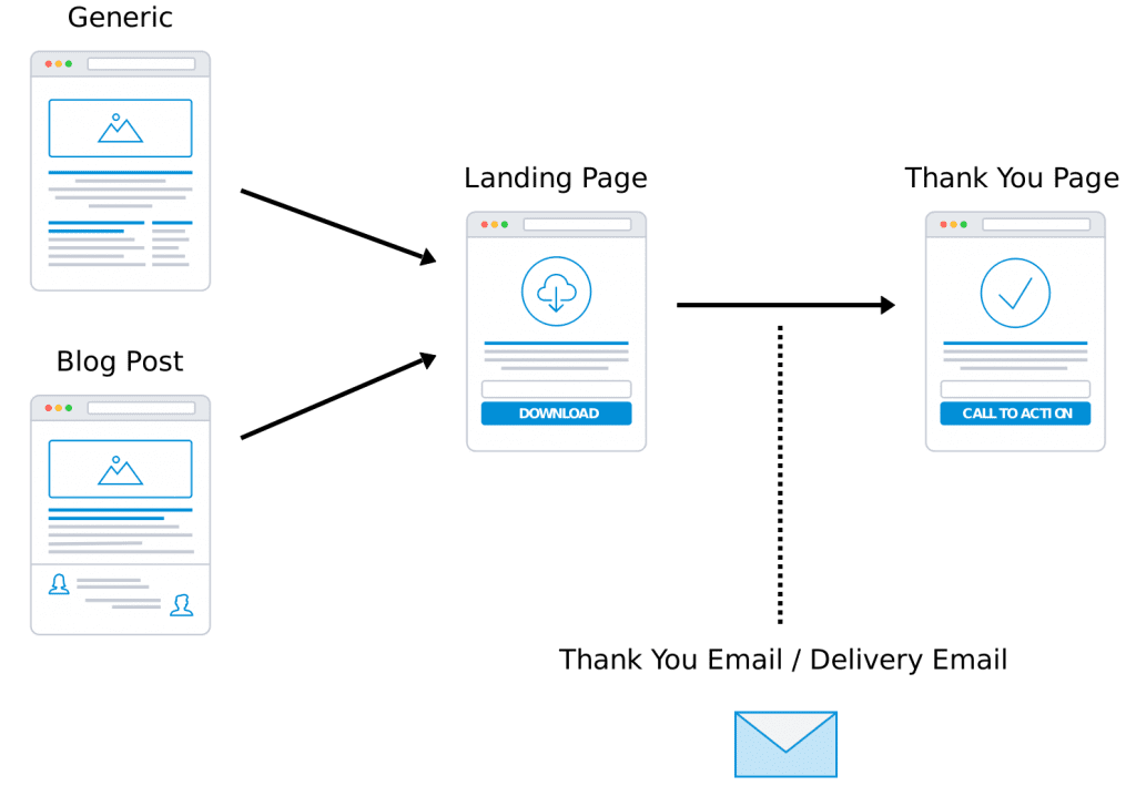
Let me explain the 5 parts briefly:

  1. Generic Website Pages. These are the static pages of your website, e.g. the homepage.
  2. Blog Posts. These are the dynamic portion of your website, e.g. this post, or this one.
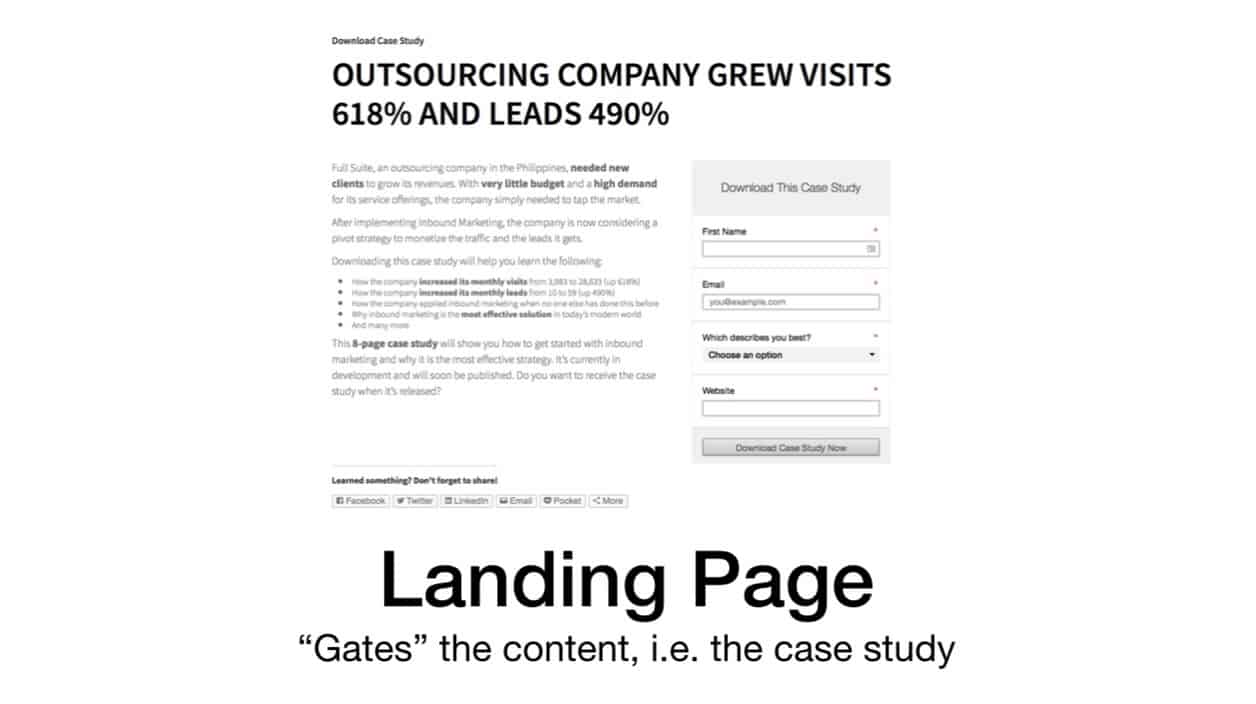
  3. Landing Page. Landing pages are specific pages on your website designed to convert visitors. It’s used to “gate” certain types of content so only those that fill-up a form will be able to access the content. After the visitor fills up a form, they are redirected to the thank you page.
  4. Thank You Page. I’ll discuss this more below.
  5. Thank You Email / Delivery Email. This is a special kind of email. It can only be “accessed” by those who went through your landing page (as depicted by the dotted line). It can either contain a link back to the thank you page or used to deliver the offer itself (download link for a PDF report).

Here’s how they all work together. I labeled them so it’s easier to follow along.

Screenshot of HomepageScreenshot of Landing PageScreenshot of Thank You Page

4 Key Elements of a Thank You Page

1) Bring Back Navigation Menu

Now that you have successfully converted your visitor, the next step is to keep them engaged.

That means you bring back the navigation menu so they can take a look at the other parts of your website again.

2) Show Your Appreciation

Kindness goes a long way.

They just entered their private information. If they don’t know you, there’s some sort of doubt and fear in the minds.

Simply thank them and show your appreciation.

3) Deliver on the Offer

This is the MOST important element that I’ve seen so many marketers fail to include properly.

I’ll say this again. This is the most important element.

The thank you page must deliver on the promise you gave beforehand immediately and clearly.

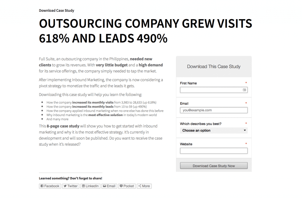
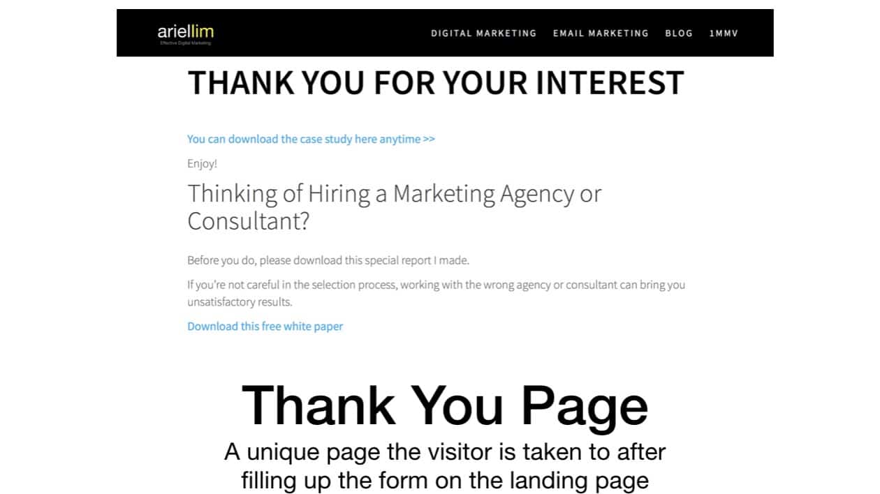
For example, if you decided to download the case study or the white paper I made, upon reaching the thank you page, you will be able to download it without it. No more additional steps. No further hassles.

Sure, there are variations in which you can do this. For example, you don’t put the download link in the thank you page, but use the thank you email/delivery email instead. And that’s ok.

But the crucial part here is that you have to CLEARLY explain that.

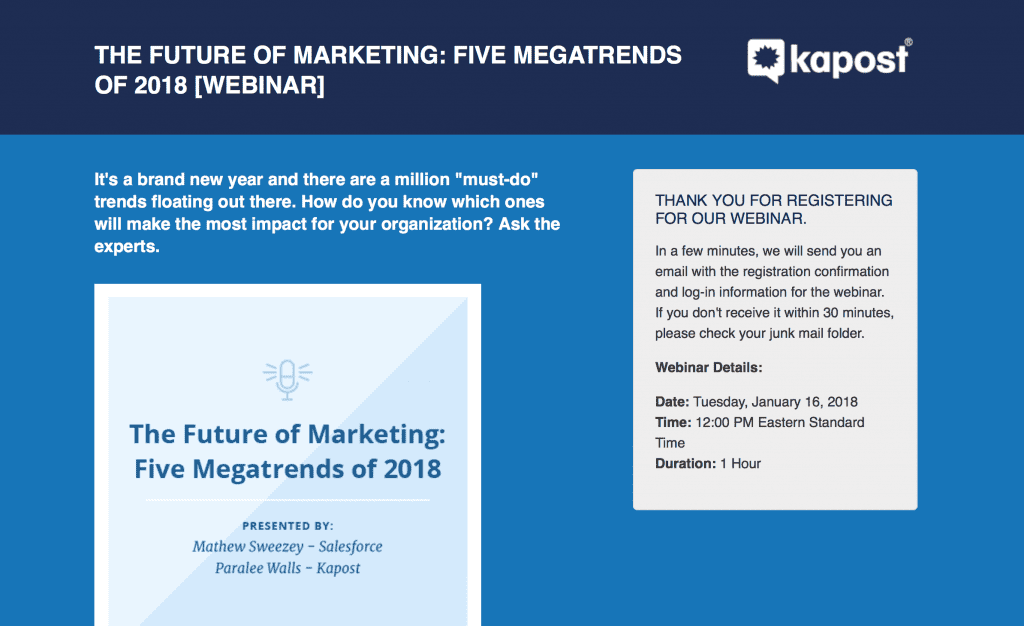
Here’s a great example where the offer is a webinar. Since you can’t access that webinar immediately, they clearly explained the next steps and what to expect.

Example of a Thank You Page Where Next Steps Are Clearly Stated

I’ve seen a lot of organizations get this wrong. For example, they offer a PDF download. Then, when you get to the thank you page they are trying to sell you something. Then you try a cmd + F to search for the word “download” and it’s nowhere to be found.

So you check the thank you email. It’s the same thing. No download link. Only salesy message. They ask you to subscribe or pay them this to access it further. That’s misleading. And, in my opinion, unethical.

Don’t ever do that. I recently posted another article that that’s probably the biggest reason your email list isn’t growing.

4) Provide a Secondary Offer

Add a secondary offer or call-to-action (CTA) on your thank you page.

This works best if you add the logical next step in the process.

For example, your offer is a free social media calendar. Then, your logical next step offer might be a free trial of your social media scheduling tool (assuming you’re Buffer or HootSuite).

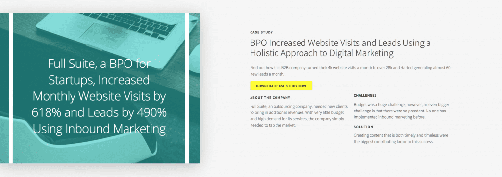
In the example I used, I simply added the only other offer I have. While it’s not the best use of the secondary offer, it is still better than having nothing at all.

(On the other hand, it’s actually a logical next step if you own your own business. Think about it. You want to find out more if digital marketing is for you, so you download the case study. Then, assuming you’re convinced that you need digital marketing but can’t do it yourself, you’re probably thinking of outsourcing it to a consultant or an agency. That’s the reason why I added the white paper for download there.)

Also, feel free to use videos here or more graphical images.

Use Your Thank You Pages for Conversion Tracking

Tracking conversions is one of the activities you should focus on as a marketer (instead of looking at likes and shares).

Conversions are any meaningful actions performed by your visitors. These are defined by you. Most of the time, the industry and/or the campaign determines what a conversion is.

Some examples of conversions are form submissions and a purchase.

These conversions are, traditionally, tracked using thank you pages.

Why?

Because theoretically, no visitor should be able to reach your thank you page unless they fill out the form on the landing page first.

One of the attributes of an effective thank you page is a unique URL — meaning, a unique page on your site. Just as you should have multiple landing pages (for different offers), you should also have multiple thank you pages. It’s best to have a 1:1 ratio. That way, you can customize your message every single time.

Imagine if you only have one thank you page for the different landing pages you have. So a person who downloaded a PDF will see the same page a person who subscribes to your newsletter. How, then, can you personalize your appreciation?

A lot of popular analytics software and advertising platforms use this kind of tracking. Google Analytics, AdWords, and Facebook all use the thank you page as a way to track conversions.

What About You

Are you using landing pages and thank you pages on your website? If not, you’re probably not hitting your conversion targets. Remember, a landing page’s average conversion rate is only between 1-3%.

If you’re like most organizations, the only landing page you have on your website is the contact us page. Think about how many traffic you need to visit that contact us page before you hit your targets.

And if you’re not creating marketing offers and setting up landing pages on your site, you’re probably saying that digital marketing is not for your industry.

But really, is it because of the industry, or is it because of you?

Biggest Reason Your Email List Isn’t Growing (and You’re Probably Not Aware of It)

img 1862

There are a lot of reasons why your email list isn’t growing. But from observing over 20 email marketing accounts, the biggest reason your email list isn’t growing is inconsistency with your message and your offer.

Here are a few examples where a lot of marketers fail at this:

  • They offer a newsletter subscription but only sends out sales messages. A newsletter subscriber expects content, not promos and discounts.
  • They offer a PDF for free download but requires you do 20 more steps or make a subscription before you get the download. Then you get enrolled in a never ending sales pitch message.

The promise doesn’t match with the delivery. It’s inconsistent. And it just adds frustration to your viewers.

But wait a minute. You might be telling yourself, “aren’t newsletters supposed to contain my products and services?”

We’ll get to that later on. For now, let’s explore the concept of message match.

Message Match Principle

Unbounce calls the matching of promise-delivery message match. Here’s what they say in their website:

A measure of how well your landing page copy matches the phrasing of the ad or link that brought the visitor there. For PPC marketers, this means matching your ad copy to your landing page headline. Strong message match increases conversions because it reassures people they’ve come to the right place.

While they were talking primarily about PPC and advertising, the principle remains the same — your call-to-action must be consistent with what the user sees after performing an action.

Make sure you remove as much friction as possible. This makes it easy for people to convert.

Message Match in Action

Let’s go back to the question I posted earlier about newsletters containing promotional messages about your organization’s products and services.

If you haven’t guessed already, the answer is no.

A BIG FAT NO.

Masking your promotional messages as as a newsletter is one of the most ineffective email marketing tactics so prevalent in the Philippines.

In fact, because there are no regulating bodies about spam in the country, email marketing remains one of the most primitive aspect of digital marketing.

On the other hand, it is an area where you can make a huge difference by making small changes. Below are some of them:

  1. Don’t send that “newsletter” you’re working in right now
  2. Create content that is helpful
  3. Segment your list and send the content you made to each of these segments

Your email marketing activities should not be focused on sending promotional messages alone. If you look at the vast majority of emails you can send, that’s only 1/12 of the entire repertoire.

It’s like playing basketball. You don’t score only by using layups. There are jump shots, free throws, and 3-pointers. No team ever won a game using only 1 way to score.

What Is a Landing Page

img 1823

A landing page is a page on your website that allows you to offer something of value in exchange for the visitor’s information through a form. It is designed for the sole purpose of conversion (e.g. visitor to lead). It is the page that “gates” the marketing offer. What that means is the person needs to fill-up the form in order to access the offer.

Generally, a landing page can refer to any page on your website that a person “lands on,” but when it comes to effective digital marketing, we will refer to a landing page as a page designed solely for the purpose of conversion.Landing Page Example: Full Suite Case Study

The image above is an example of a landing page here on my site. It’s a case study about an outsourcing company and how I helped them grew their visits and leads.

Before any person can download the landing page, they have to fill-up the form first. Then, they get redirected to a thank you page where they can download the case study.

9 Key Elements of a Landing Page

1) No Navigations

If you look at the image, you would notice that there are no navigation links in the header and footer. The primary reason for this design is that it supports the primary purpose of the landing page — to convert.

Navigation menus are distractions. People can navigate away from your landing page (thus, not helping you convert them) or visually distract them from the main message of your offer.

So, with no clear benefit and lots of risks, it’s better to remove them altogether,

2) Clear Message on Header (and subheader)

The header (and subheader) should tell your visitor immediately what they can expect. In my case, I shared actual numbers/results of the company.

Pro Tip: Using principle of message match, having a clear header makes it more powerful. Basically, the message of the “ad” or “call-to-action” leading to your landing page should match the message of the landing page. For example, on my homepage, you will find this section:

Call-to-action Example: Message Match

When people click on the Download Case Study Now button, they get redirected to the landing page.

Imagine what would happen if they saw the call-to-action on my homepage and after clicking, they get redirected to the Contact Us page.

This is the case for a LOT of websites out there. They created an offer (yey!) but leads them to the contact us page (boo!).

3) Depict Benefits, Not Features

Use this section to clearly highlight the benefits for the visitor. In my example, I explained how the company increased in visits and leads. I also included actual numbers here because who doesn’t love numbers, right? It just proves that this is a real example, not just made up.

4) Use Formatting for Easy Read

If you noticed, my landing page has bold text and bulleted items. I also made use of headers (as you’ll see in the size differences). This clearly shows the different segments of the page.

Moving to another example, take a look at this page. Notice how I use headers to mark the different sections and subsections.

It’s easier to read. It gives your visitors some background on what you are saying.

5) Include an Image

An image helps your viewer understand better and faster what you’re offering. I didn’t use an image in my landing page (but it’s present in my call-to-action) because I ran an A/B test and having no image was better at converting.

But generally speaking, having an image is better than none at all.

If you’re offering a webinar, use the speakers’ headshots as your image. If you’re offering a checklist, make a small thumbnail so people can see what they’ll get.

6) Form Should Stand on Its Own

What this means is if you remove all the headers, text, and images on your landing page and you’re left with the form, it should still make sense.

My form has a header that tells the visitor to download this specific case study. Then, at the end, my call-to-action tells the reader exactly what they can expect after filling out the form (see #8 below).

7) Ask Only Relevant Information

My form only asks for 4 fields. You have to figure on your own how many fields and which questions should you ask. But here’s what you need to remember:

  • more fields = more qualified leads
  • more fields = lesser conversion

The best way to go about this is to align this with your buying stages. If a person converts at the beginning of your sales cycle, then ask fewer fields. If they’re at the bottom (meaning almost ready to buy), ask more questions.

8) Align the Call-to-Action to the Offer

I already mentioned message match earlier. This is a different one. I’m talking about the call-to-action on the form itself here.

In my landing page, it’s “download case study now.” What it does is it removes doubt and uncertainty in the minds of the visitor.

They are exchanging their private contact information. That is a scary thing for most people especially with a lot of fraud and scams out there. So, use this part to remind them what will happen next. In my case study example, I leave no room for doubt as to what they’ll get next — download the case study.

The default text for most forms is “submit.” Doesn’t reassure you of what’s going to happen next, right?

9) Include Social Sharing

Lastly, include social sharing in your pages. This, personally, is debatable. But I find that it doesn’t affect conversion rates.

So, with a better chance of reaching more people (when your page gets shared on social) and no downside, add social sharing icons on your landing pages.

Improve Your Landing Pages Today

1) Don’t Rely on the Contact Us Page

The contact us page is one of the most common landing pages out there. However, for most websites, it does not follow the best practices I described in the section above.

Also, by limiting yourself to just one landing page, you’re hurting your conversion rates.

In a white paper I published last year, I used these two statistics that will convince you that using only a contact us page will not give you the results you want.

A survey of more than 7,000 businesses shows that companies see a 55% increase in leads when their landing pages increase from 10 to15.

The same report also found that those with over 40 landing pages increase conversions by 500%!

The typical conversion rates for landing pages is only between 1-3%. So, a single contact us page will give you unsatisfactory results.

2) Create More Marketing Offers

A marketing offer is another term for a lead magnet or a trip wire — all these are fancy marketing terms. But basically, a simple way to describe marketing offers is something of value to your leads and customers that they are willing to exchange their contact information for.

The most popular examples right now are webinars. Of course, there are the PDF downloads like what I have. They can be regular eBooks or white papers or reports. You can also offer worksheets, spreadsheets, templates, you name it.

The key point here to remember is that they should provide value to your leads and customers. A newsletter signup without offering content is not one of them.

So, think about how you are using landing pages on your website. If you only have a single contact us page and nothing more, don’t be disappointed when you don’t reach your marketing goals.

Start creating marketing offers and set up more landing pages on your site.

Biggest Marketing Prediction for 2018

img 1749

The biggest marketing prediction for 2018 is marketing automation. It’s going to be the next big thing.

If you’re not using it, you’ll get left behind.

Marketing automation has been around for a while. There are a lot of software and tools you can use to automate your marketing activities. But adaption by marketers especially in the pickups us very low.

Why Marketing Automation Will Be Big in 2018

1) Digital marketing is maturing

What that means is organizations are starting to learn that likes and followers aren’t right metrics to track in digital marketing.

They are starting to learn how to measure ROI properly.

In the last 5 years, these vanity metrics have been the sole focus of organizations. Primarily, because CMOs don’t know any better.

Most CMOs from big organizations live and die by traditional methods — such as billboards, TV ads, etc. When digital entered the scene, they merely translated their offline activities to their online campaigns.

With billboards, TV ads, and the like, the goal is to maximize impressions. Super Bowl, prime-time TV spots, and much more are the coveted and most expensive spots to place your ads — primarily because a LOT of people are tuned in during these times.

The equivalent of maximizing impressions in digital is reach and followers.

Now, as the industry is maturing, CMOs are learning that these metrics aren’t enough.

2) Marketers are overworked

The demands from the modern marketer are far greater today than it was just 3 years ago.

Now, it’s a prerequisite to be knowledgeable in almost all aspects of digital marketing: from SEO, social media, PPC, social ads, email marketing, and analytics.

This transition from a specialist to a generalist couldn’t have come sooner.

The more involved the marketer across the entire customer lifecycle, the better it is for the customer — and consequently, better for the organization.

This brings us to number three…

3) Marketing budgets aren’t increasing

The marketing budgets of organizations haven’t increased overall across industries.

That means no new tools and no new headcount.

And with a never-ending task list with no additional budget, you’re left with only two options:

  1. Spend more time working; or,
  2. Use marketing automation

We all know that putting in more hours will not solve the problem. So, that leaves all of us marketers with the only option — use marketing automation to speed up our work.

Conclusions: The Need for Marketing Automation

Marketing automation is still in its early days. There are already a lot of tools out there.

One of the most popular (generic) automation out there is called IFTTT — which stands for if this then that.

There are function-specific tools like Buffer and RecurPost for Social Media. You also have Goodbits.io for email marketing.

Then you also have Zapier that allows you to integrate different and complex systems together. Or the all-in-one marketing softwares like HubSpot and Marketo.

Most of these marketing automation tools are free. Almost all of them use a freemium model.

At the end of the day, your job as a marketer is continuously evolving. If you don’t deliver results for your organization, you’ll be in trouble. Learn more about marketing automation and start using it.

I’ll be writing more about how I use these tools over the next few weeks. If you’d like to learn how these tools work, simply subscribe to my newsletter.